Rows: 1586 Columns: 7
── Column specification ────────────────────────────────────────────────────────
Delimiter: ","
chr (7): Author, Title, Type of Ban, State, District, Date of Challenge/Remo...
ℹ Use `spec()` to retrieve the full column specification for this data.
ℹ Specify the column types or set `show_col_types = FALSE` to quiet this message.Data, DataViz, and Stats with the Stars
2025-06-28
Orange? What is this Orange stuff, anyhow?
Orange is a visual drag-and-drop tool for
- Data visualization
- Statistical Tests
- Machine Learning
- Data mining
and much more. You can download and install Orange from here:
What does Data Look like?
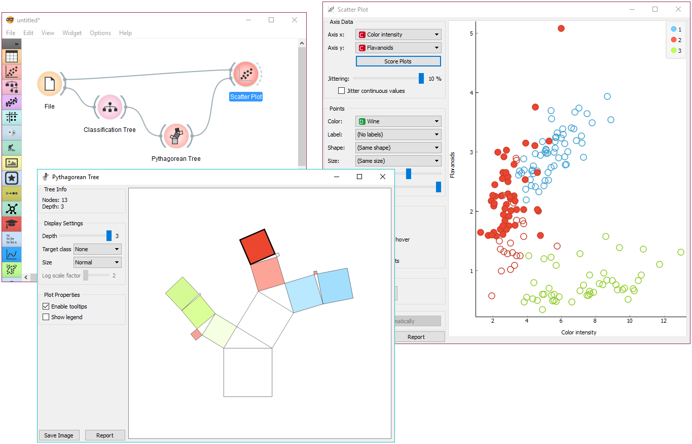
Orange Practice Session#1
- Let’s use the
Datasetswidget - Click on it to select one of the built-in CSV files :
Auto MPG - Let’s look at the Data using the
Data Tablewidget - And create a Scatter Plot with the
Scatter Plotwidget (Horsepower vs Displacement) - Try the menu options on the left side to see how they alter the plot

A Pillar of Statistical Wisdom
Steven Stigler (2016) in “The Seven Pillars of Statistical Wisdom”:
- One of the Big Ideas in Statistics is: Aggregation
- How is it revolutionary?
- By stipulating that, given a number of observations, you can actually gain information by throwing information away
- In taking a simple arithmetic mean, we discard the individuality of the measures, subsuming them to one summary.
Brad Pitt: Throwing it All Away
What was he throwing away?
All the “Variables”
- Age
- Previous Seasons
- Waist Size
- Treadmill Test Score
- Bat Speed?
- Smoke Weed?
- Girlfriend?
- Girlfriend Looks Rating?
- Waddles like a Duck?
- Looks Weird?
And he was looking ONLY at…
- To summarize is to understand.
- Add to that the fact that our Working Memories can hold maybe 7 items, so it means information retention too.
- Borges wrote, “To think is to forget details, generalize, make abstractions. In the teeming world of “Funes the Memorious,”, there were only details.”
- Brad Pitt aka Billy Beane was throwing away the details, and looking at the aggregated picture to pick his future Oakland A’s team.

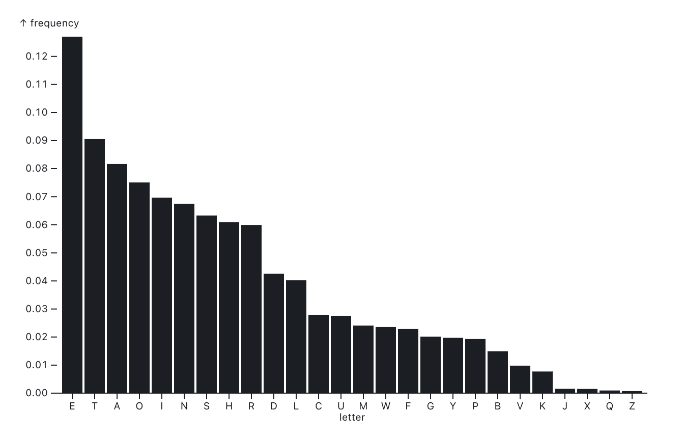
In the Sherlock Holmes story, The Adventure of the Dancing Men, a criminal known to one of the characters communicates with her using a childish/child-like drawing which looks like this:

How would Holmes decipher this message?
- Using Conjectures:
- Symbols -> Letters
- Based on well-known Counts of letters (Zipf’s Law)
- Holmes deduces that the most common letter in the message is “E”
- He then deduces that the second most common letter is “T”
Research Question
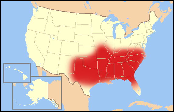
Do some States ban more books than some others?

What is the Story Here?
- Texas is the worst at book banning!
- Texas, Florida, Oklahoma, Kansas, Indiana,..are next in line
- Is there a “Bible Belt” story here?
Research Question
What are the kinds of bans that are being imposed on books? How many books banned by each type of ban?

What is the Story Here?
- Four reasons for banning books
- “Investigation” is the commonest kind of ban
- How does one “investigate” a book???
Nursery Rhymes with Ben Affleck
- In “The Accountant,” Christian Wolff is heard reciting “Solomon Grundy,”
- The nursery rhyme tells the life and death of a man named Solomon Grundy, all within a single week.
- It was innocently used to help children learn their days of the week.
- However, when we look into the fact that Thursday through Sunday detail the tragic end of Mr. Grundy due to an unspecified illness…
- it’s hard to ignore the dark undertones.

What is the Data here? And the Chart?
- The data is the days of the week.
- The data is the number of events that happen on each day.
- The y-variable is a Quant variable, a number
- The x-variable is also Quant variable, a time variable
Note
Tourist: Any famous people born around here?
Guide: No sir, best we can do is babies.

Orange Practice Session#4
- The data is the number of births in the USA, by day, month, and year
- Let us use the
Group Bywidget to group byday_of_week - AND compute the
mean(births)in the same widget - We plot the
mean(births)vsmonth, and colour byday_of_week

Being a Mermaid with Katie Ledecky
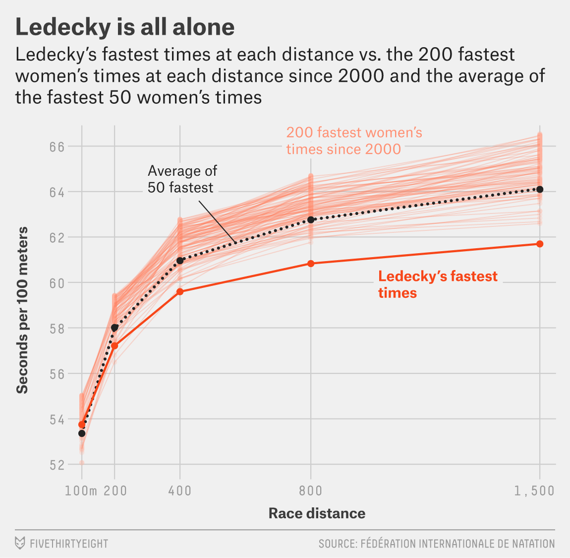
- Katie Ledecky is a swimmer, and a mermaid.
- She has won 7 Olympic gold medals, and 15 World Championship gold medals.
- She is the world record holder in the 400, 800, and 1500 meter freestyle events, and in the 4x100 meter freestyle relay, and the 4x200 meter freestyle relay.
- What does that make her? An Outlier…
So how do we find, and show, outliers?
- Outliers are data points that are significantly different from the rest of the data.
- They can be identified using box plots, which show the distribution of the data.
- Box plots show the median, quartiles, and outliers of the data.
- Of course, Ledecky was in the water! Well in.

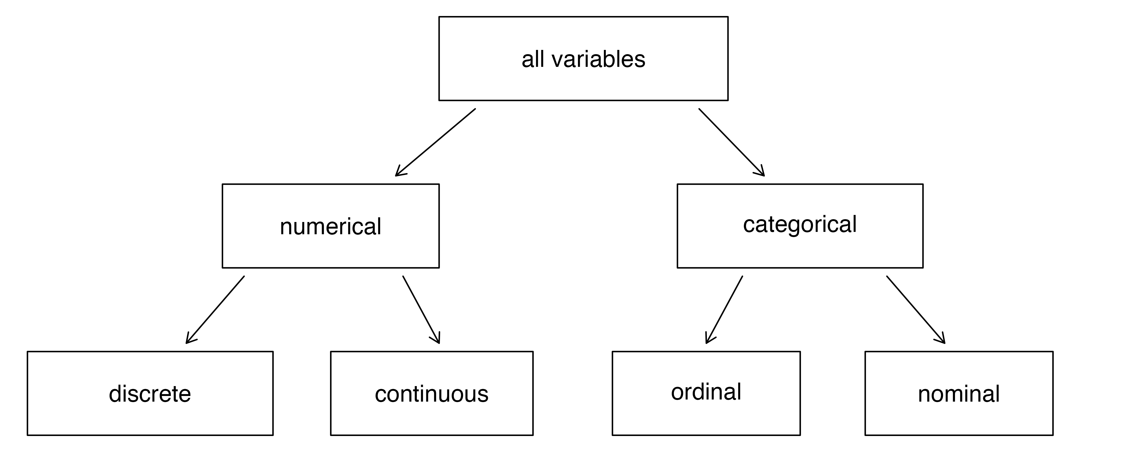
Qualitative Variables
rank: Rank of the academic (Qual)discipline: Discipline of the academic (Qual)sex: Male / Female
Quantitative Variables
yrs.since.phd: Years since PhD (Quant). Can be Qual??- yrs.service`: Years of service (Quant)
salary: Salary of the academic (Quant)

Research Question#1
Question
Q1. What is the distribution of salary? If we split by sex?
Research Question#2
Question
Q2. What is the distribution of salary, when we split by other Qual variables, such as rank?
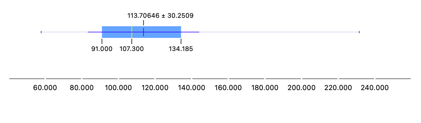
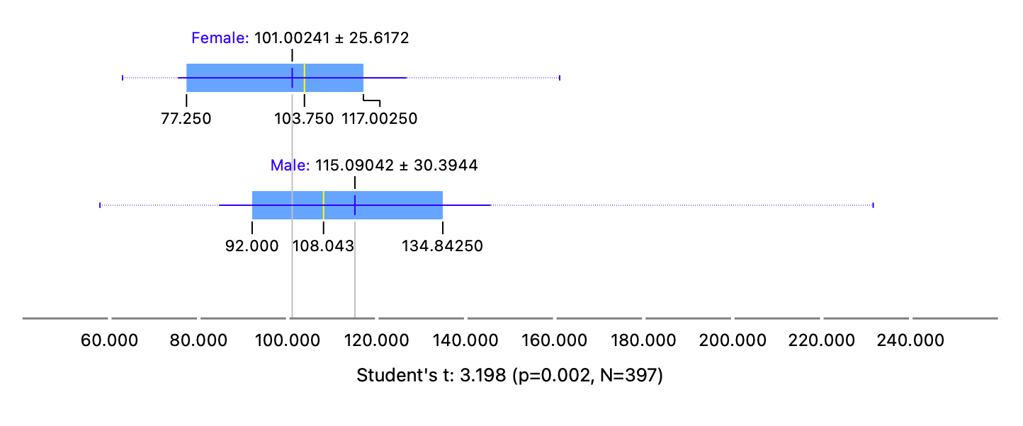
Jack and Rose lived happily ever after?
- The Titanic sank on 15 April 1912, after hitting an iceberg.
- What are the chances that Jack survived too?
- What did his chances depend on?

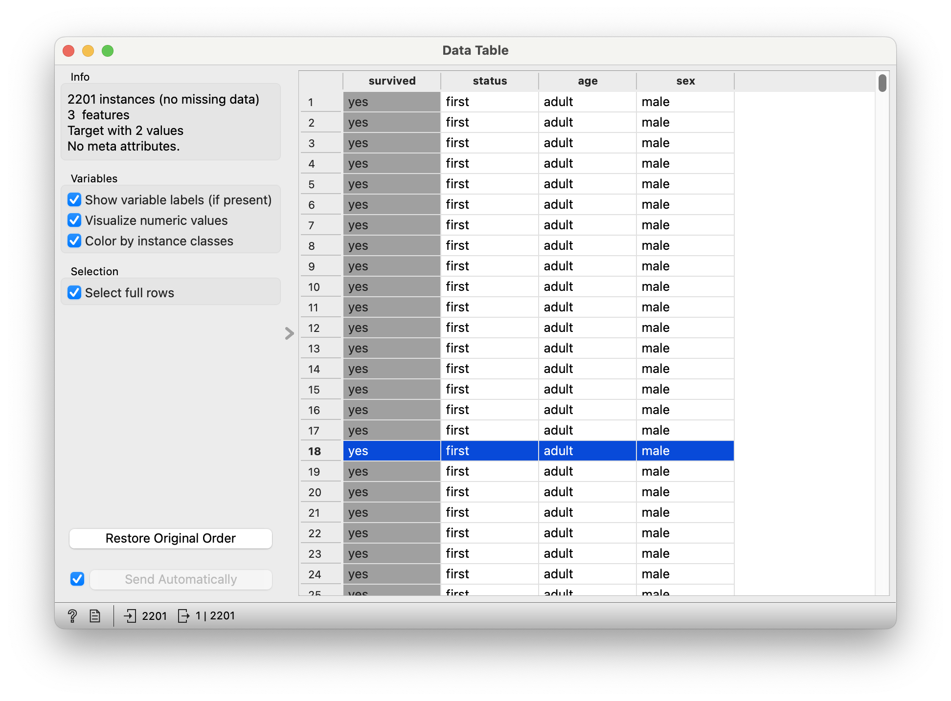
titanic
Quantitative Data
None.
Qualitative Data
survived: (chr) yes or nostatus: (chr) Class of Travel, else “crew”age: (chr) Adult, Childsex: (chr) Male / Female.
Note
What is the dependence of survived upon sex?
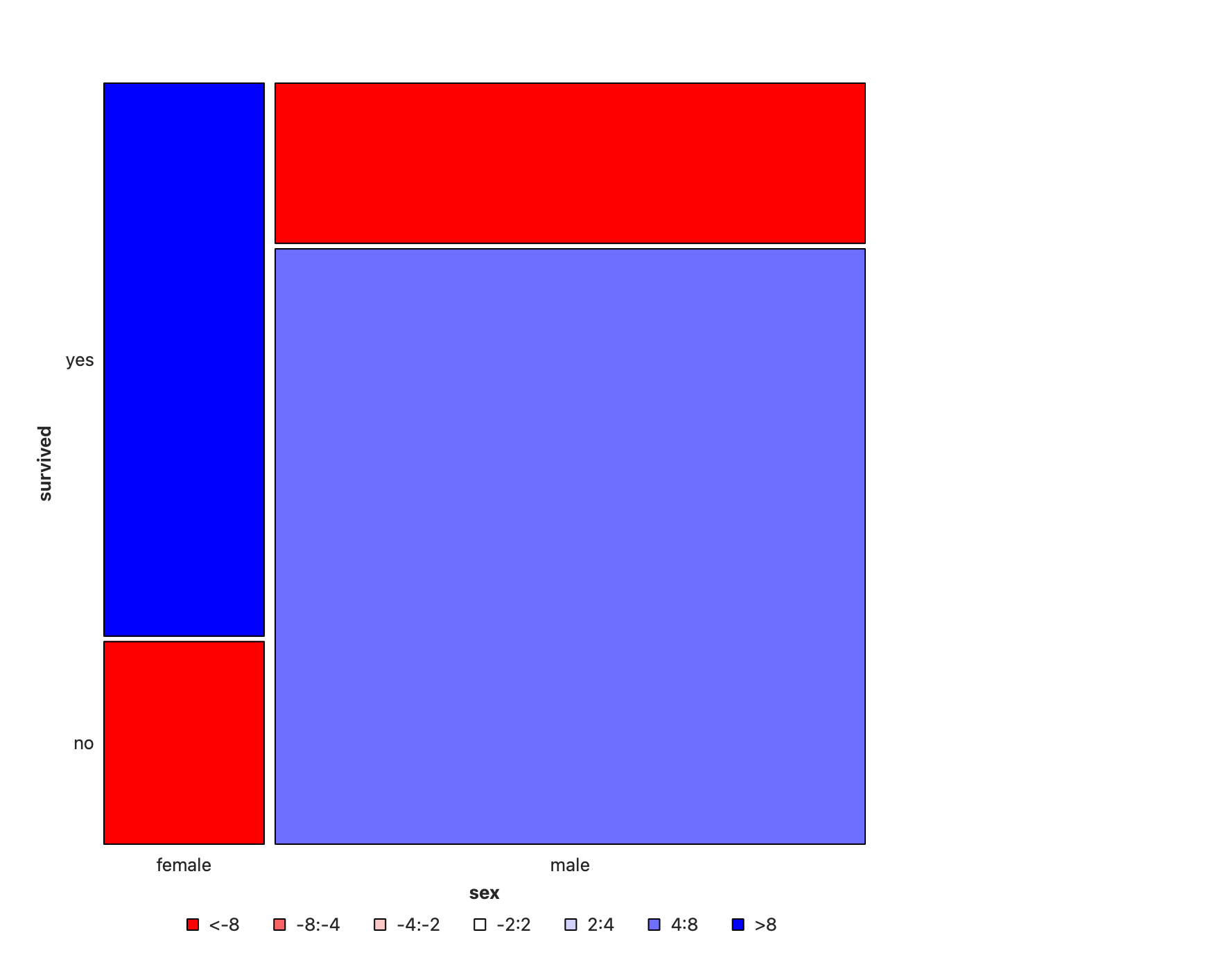
Note
- Note the huge imbalance in
survivedwithsex - Men have clearly perished in larger numbers than women.
- Colouring shows large positive residuals for men who died, and large negative residuals for women who died.
So sadly Jack is far more likely to have died than Rose.
How does survived depend upon status?
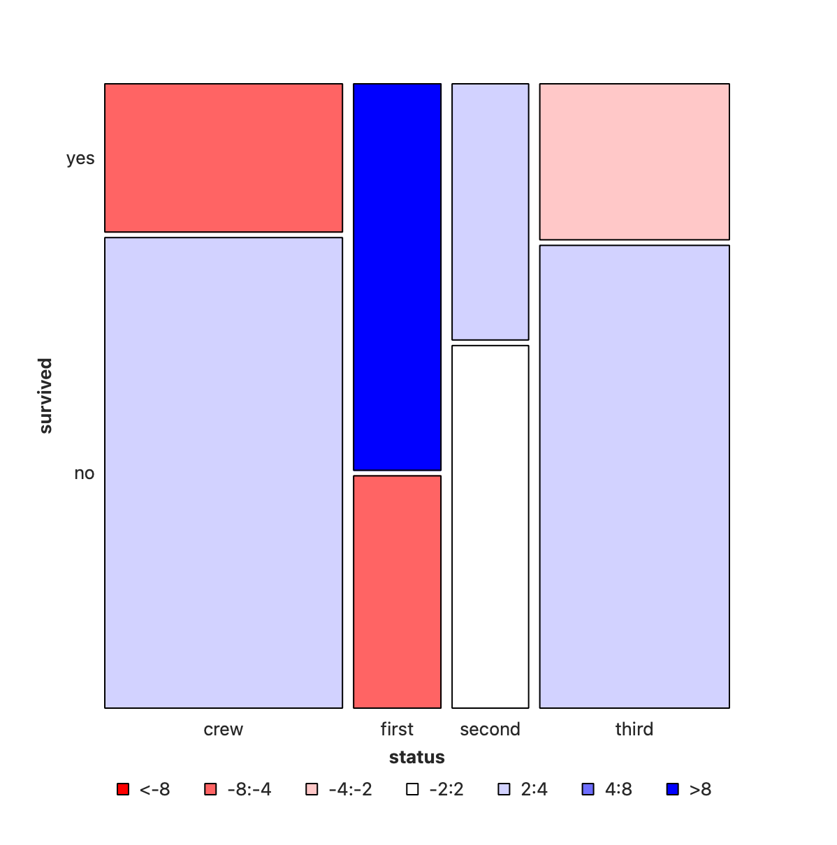
Note
- Crew has seen deaths in large numbers,
- as seen by the large negative residual for crew-survivals.
- First Class passengers have had speedy access to the boats and have survived in larger proportions than say second or third class.
- There is a large positive residual for first-class survivals.
- Rose travelled
first classand Jack wasthird class. So again the odds are stacked against him.
What are these Residuals anyhow?
When differences between the actual and expected counts are large, we deduce that one Qual variable has an effect on the other Qual variable. (speaking counts-wise or ratio-wise)


Gabbar’s Gun Chamber Permutations

The Art of Surprise with Gabbar Singh
- So it appears the call percentage is different for the two ethnicities,
afamandcauc - But is it statistically significant? Would Gabbar be surprised?
- Let us pretend
ethnicitydoes not matter and spin the revolver!! - We mess with the ethnicity variable, some 5000 times
[1] "diffprop"
The Art of Surprise with Gabbar Singh
- We are not able to mimic Mother Nature aka Reality
- The red line is the observed difference in proportions, and it is way out of the null distribution.
- So we can reject the NULL Hypothesis that
ethnicitydoes not matter. - Hence we infer that there was bias in the hiring process, and that
afamcandidates were discriminated against.
[1] "diffprop"